Sunday, May 31, 2009

Journal For Plague Lovers Is A Visceral Wake


First, a disclaimer of sorts. I have a very, very complicated relationship with the Manic Street Preachers. IMO, they are easily one of the most interesting bands of all time. As I've mentioned in a previous post, the book Everything: A Book About The Manic Street Preachers is one of the most fascinating rock books ever published. But that book would not have been interesting if the individuals that were the focus - James Dean Bradfield, Richey Edwards, Nicky Wire, and Sean Moore - were not some of the most unique characters to ever walk on a stage. Hyper-literate, preternaturally intelligent, half musical prodigy half total novice, painfully sincere, these were not your average, ordinary rock stars. Nor was the music they produced: debut single Motown Junk was an exhilarating blast of blazing guitars and spit out, staccato lyrics. It set the tone for their entire career.

Truly, I can say that MSP changed my life. In an incident I still do not comprehend, my life was irreparably altered by one of their songs while walking in Cambridge, England in 1999. Ever since that moment, I have felt fused to them in a way different from most bands that I love. I still cannot explain it.

Disappointing then, that every album post This Is My Truth, Tell Me Yours has been letdown after letdown. Not bad albums really, just kind of boring and forgettable. And after you have had your life changed by them, or even merely heard The Holy Bible or A Design For Life, it is somewhat painful to recognize that each new album was - transitory and harmless. I had reached the point where I felt that there would be no comeback, or return to form. MSP had altered themselves - maybe evolved more precisely - to become a safe, greatest hits performing stadium group. Just seeing Nicky Wire occasionally perform in his Richey/Stay Beautiful era feather boa made me cringe - the act itself felt like just that - an act from a band that had begun so painfully sincere.

But here is the really complicated part: I always felt that I could not blame them for developing into this innocuous, disposable form. MSP had been altered, but not by James or Nicky or Sean, but by Richey of course. Richey's abrupt disappearance on February 1, 1995 remains one of the biggest mysteries in rock history, and maybe the most interesting and hoax-free. I cannot imagine what it is like to be MSP - is Richey dead? Alive? Could he walk in the door at any moment? Where is Richey? And what happened to him? After all, this was a band of best friends since childhood, a tighter unit than any in rock history. Surely the fracture felt by Richey's disappearance was a such a formidable severance that they could not, should not, attempt to be the same band.

With each successive album, Nicky's lyrics became more and more trite, evidently written by a man bored with the practice without his brilliant, obsessive sparing partner to compose with. And though I tried as a listener, to connect with Found That Soul or Your Love Alone Is Not Enough or Baby Elian or For The Love of Richard Nixon I simply could not help but feel as though these were hollow shells that I could not truly feel. But clearly this was a band (at least somewhat) operating on fumes. And while being hard to swallow as a fan, I always felt torn - while fiercely loyal to MSP, in my heart of hearts I knew that each new album was - to paraphrase Sick Boy in Trainspotting - not good.

And so, here in 2009, arrives a most unexpected renaissance - Richey is back from the dead, or wherever he may be. Though he did not physically walk in the door, his return is no less surprising and unsettling. The band decided to write their new album around Richey's left behind lyric book. This was not simply a group taking unfinished poetry and setting it to music - these were actual finished lyrics that Richey had completed and submitted to the rest of band a few weeks previous to his disappearance. This was not unusual - Richey's modus operandi was to complete a vast collection of lyrics and then turn them over to James and Sean to pair with music they had previously written.

So after all these years, there would be a new MSP record lyrically composed by Richey. That album, entitled Journal For Plague Lovers, is here. Intended as a companion to The Holy Bible, JFPL is a risky proposition. As another reviewer noted, it is a bit like Oasis releasing Definitely Maybe II or The Rolling Stones bringing out Another Exile On Main Street. In other words, by consciously invoking comparison to their finest work, MSP placed themselves in the unenviable position of being judged against a now mythical, monolithic work of genius. Frankly, I like the guts MSP has shown by taking on this challenge. Before even hearing the album, I felt that by even attempting such a task proved that MSP had awoken from a now decade long slumber.

JFPL, it must be said, is not equal to The Holy Bible. It couldn't be. It is not possible. That being said, it is easily their best album in a decade, and crackles with a vitriolic viscerality not seen since their mid-nineties peak. Even the cover art hearkens backwards - provided by significant British painter Jenny Saville - as she had previously for The Holy Bible. The choice of legendary producer Steve Albini is a superb decision - Albini does what he does best here - he gets out of the way and simply documents the music. All the pieces set in place, the questions became: would MSP rise to the challenge? Could MSP rise to the challenge, or had too much time spent asleep paralyzed them? Is the bar set by Richey too high too attain without his physical presence?

Opening with a sample from the Machinist, Peeled Apples rips open with a ferocity and darkness heavier than anything MSP has written since PCP faded from memory, and their second best album opener ever, second only to Sleepflower from 1993's overproduced Gold Against The Soul. It is immediately obvious that we are firmly worded in Richey territory - only Richey could have written the chorus - "Riderless horses in Chomsky's Camelot". This is vital, hair standing up on the back of your neck songwriting, the likes of which is a region tread by Richey Edwards and Richey Edwards alone.

The Manics pop inclinations show up immediately, in the form of Jackie Collins Existential Question Time, which features my favorite lyric on the album, a nostalgic but smirking, "Oh Mummy, What's A Sex Pistol?". It's poppy in the way that From Despair To Where or Australia is, but with that odd discordant structure that is unique to James Dean Bradfield's songwriting. A breezy melody and soft vocal delivery mask a lyric as dark and desperate as any in the MSP canon. It's an exhilarating blast of pop, paired with exceptionally dark lyrics concerning the question of if a wife dies without knowing her husband was cheating, then does that constitute being unfaithful? I imagine it was these types of debates that would keep Richey up at night.

Some of the other highlights are the title track, as well as Marlon J.D. which includes a sample of Marlon Brando speaking, and features the excellent line, "I will not beg/because this is how I am". Virginia State Epileptic Colony treads a musical territory similar to Interiors from Everything Must Go. Actually much of the album feels similar to Interiors in the dry production and rough textured guitars. The record clips along, each song pointing into the next, until Nicky Wire takes over the vocals for closer William's Last Words. The experience of listening to William's Last Words is extremely difficult - the lyrics are a suicide note expressing thanks and gratitude to the friends being left behind - and I cannot imagine what the experience must have been like for the men of MSP. Confused, complicated, contradictory - William's Last Word's, like JFPL, is Richey Edwards to the last.

The entire album drifts in an odd darkness, and as much as it is described as a sort of sequel to The Holy Bible, it is more of a companion piece, as this is a different, yet related territory. The Richey-less, poppier inclinations of MSP creep into some of these tracks - and it isn't always a bad thing, just an important distinction. While The Holy Bible is a black hole without even the suggestion of light, JFPL lingers in a half-dark twilight. Richey is here in every breathe, every note, in the atmosphere and cinematic scope. His spectral visage is difficult to remove from the mind of listener. Richey's lyrics, as always, are cryptic, puzzling, disconcerting, and extremely powerful, conjuring images and juxtapositions that make the listener squirm. There is a power here that is unlike any other in modern rock and roll.

It must be said that JFPL is unlike any other listening experience I have ever had, carrying so much baggage that it is not possible to separate all that we know, all the history, mystery, and drama that is MSP from the actual music. In an age of faceless, nameless, disposable pop and rock, JFPL is the rarest of objects - an album that challenges the listener with complex and incongruous emotions. In the midst of all this confusion an unexpected emotion emerges for the listener - a comforting feeling of visiting an old friend. Even in the bleakest lyrics, one cannot help but feel a warmness at the thought of Richey sitting somewhere, writing them. So many conflicting emotions, sometimes diametrically opposed from listen to listen.

The entire experience of listening to the album feels like sitting around a seance table, listening intently to the disembodied voices of the dead. At the very least these are lyrics from another era - the early/mid nineties - referencing culturally significant period events long since passed. Perhaps this is a rebirth for the band, perhaps it is merely a sideways jaunt. Regardless, JFPL is an unforgettable listening experience, and that in itself is its own reward. Thank you Richey, for giving us this last gift from your place of internment, or from wherever you are.

This is the aural and emotional wake of Richey Edwards, one that never occurred due to the circumstances of his disappearance. JFPL is truly a final opportunity to recognize his unusual talents and recognize his rightful place in the pantheon of greats. Thank you MSP, for laying Richey to rest in the most fitting way possible - a flawed, distressed, clarion call from beyond the grave.

The Verdict: 4 out of 5 stars.

BTW - superb interview with James and Nicky here, the full res cover here.

Glasvegas Link My Atlanta Show Review On MySpace

I know it's a nerdy thing to do, but I just noticed that Glasvegas linked my Atlanta show review on their official myspace site. Yeah, I think it is pretty cool.

BTW - check out the Glasvegas B-Side The Prettiest Thing On Saltcoats Beach when you can. It's the current song that I am binging on at the moment. It's a great little piece of Specter-ish, pocket-epicry.

Dig it.

Saturday, May 30, 2009

Graphic Design Portfolio Lesson Is Helpful


One of the most challenging issues any artist or designer faces is the creation of the portfolio. The portfolio is the acid test for designers.

So what do you include? What do you leave out? What sequence should the work be in? Once you have made these decisions and then are in the interview, what do you say about the work? What is the most pertinent details to discuss? What is insignificant? These are the questions that keep designers up at night.

Over at the always superb Psd Tuts is an insightful article tackling these issues and more. It is well worth the read for any amateur or professional artist or designer. Read it here.

Ivy Leaves Now Available On Amazon


The 2009 Ivy Leaves Art & Literary Journal is now available via Amazon.com. You can buy a copy here. Support the arts!

Design For Social Impact Is Crucial


IDEO's David Kelley is kind of one of my heroes. He is always interested in the social implications of design. Right now over at IDEO there is a superb piece called the Design For Social Impact Workbook and Toolkit.

You can download the pdf and read it over. As usual, it's excellent - do check it out.

Take a look here.

Wednesday, May 27, 2009

Old Comic Book Covers Bring It All Back Home


Recently, I came across a big stash of old comic book covers from the late 1980's. Back in the day I collected the Punisher and my cousin Carl collected Wolverine. We would scrounge up as many bottles and cans as we could, jump on our bikes and ride to 7-11 to return them . Whatever we could get for the returns we would put towards buying new comic books. Money in pocket, we would ride our bikes as fast as we could, cutting through back city streets, heading down to Coy's Comics in Old Town Saginaw. Coy's was always packed ceiling to floor with comics - a massive treasure trove of old issues and new that always seemed exciting to me.

Much of what I do as an artist and designer was clearly imprinted in my brain from these covers. When I look at them I see so much of what I do - positive/negative, figure/ground, visceral typography, etc.

Anyway, take a look at these, they are awesome.

Vintage Cereal Box Packaging Far Superior To Today


Looking through these vintage cereal boxes, I am struck by how concise this visual communication is. The typography, arrangement, and color palette are beautiful, uncluttered and well conceived. So, so much stronger than today.

Anyway, these are great - take a look at them all here.

Monday, May 25, 2009

Andy Adams Wordbomb Drops At Art Bomb


Andy Adams wordbomb officially dropped at the Art Bomb on Sunday, May 23. Installation was a long and strenuous process, but well worth it. It is located at 1320 Pendleton St. (the address of the Art Bomb).

Lots of good stuff here. Take some time and check it out.

Art Chantry Interview Predictably Excellent


Art Chantry is in my Top Ten Designers of All Time. Here is a great interview with him. Take five minutes and check it out.

Top Ten Stooges Songs (UPDATED)

The Stooges are one of the greatest bands in history, and are responsible for inventing punk rock. I have already talked about Iggy Pop in an earlier post, so I won't go over the same ground again. I highly recommend purchasing the re-issued versions of their eponymous, self-titled debut The Stooges, and their epic second album, Fun House. You need to purchase (and please purchase, not download) the classic Raw Power. Three albums, all classics, five star albums. So, without further discussion, here is the Top Ten Stooges Songs. Enjoy.

10. Open Up And Bleed (Heavy Liquid)
9. No Fun (The Stooges)
8. Cock In My Pocket (More Power)
7. Search & Destroy (Raw Power)
6. I Got A Right (Heavy Liquid)
5. Penetration (Raw Power)
4. Down On The Street (Fun House)
3. Loose (Fun House)
2. T.V. Eye (Fun House)
1. Gimme Danger (Raw Power)

BONUS: Somebody edited Search & Destroy with Apocalypse Now and Full Metal Jacket. This is one just awesome. Take a look.


Download:
FLVMP43GP


Sunday, May 24, 2009

Die Hundred Besten Schriften Is Coolden

The Die Hundred Besten Schriften (or 100 Best Typefaces in History) is all in German, which I do not speak, read, or write. The fact that the page is still worth spending enormous amounts of time though I don't understand the language is a tribute to how wonderful of a resource the page is. Spend some time and wander around - it is an amazing plethora of information.

Check it out here.

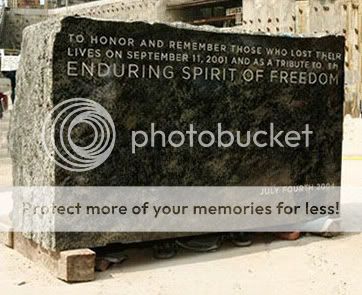
BTW - the image at left is the cornerstone of the unfinished Freedom Tower in NYC, set in Gotham of course.

Hampus Jageland is All Over the Web


Hampus Jageland has received tons of press recently, especially for his book jacket designs. He's been everywhere of late it seems - FormFortyFive, FFFFound, etc.

Take it from me - go straight to his actual portfolio, it's beautiful.

Check it out here.

Chris Seddon Illustration is Beautiful


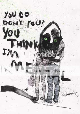
Young British illustrator Chris Seddon has a bunch of excellent work in his portfolio. It's all quite strong, but I especially enjoy the work under the "personal" tab - the ironic usage of typography dramatically alters the message of the imagery. Check it out here. Enjoy.

Saturday, May 23, 2009

The True Story of Helvetica is Awesome


Wow, is this worth the time to read! This entire article about Helvetica and it's role within the NYC subway system is incredibly fascinating. Check out the entire story here.

There is a commonly held belief that Helvetica is the signage typeface of the New York City subway system, a belief reinforced by Helvetica, Gary Hustwit’s popular 2007 documentary about the typeface. But it is not true—or rather, it is only somewhat true. Helvetica is the official typeface of the MTA today, but it was not the typeface specified by Unimark International when it created a new signage system at the end of the 1960s. Why was Helvetica not chosen originally? What was chosen in its place? Why is Helvetica used now, and when did the changeover occur? To answer those questions this essay explores several important histories: of the New York City subway system, transportation signage in the 1960s, Unimark International and, of course, Helvetica. These four strands are woven together, over nine pages, to tell a story that ultimately transcends the simple issue of Helvetica and the subway.

Pentagram's Redesign of MOMA Promo Materials Rock


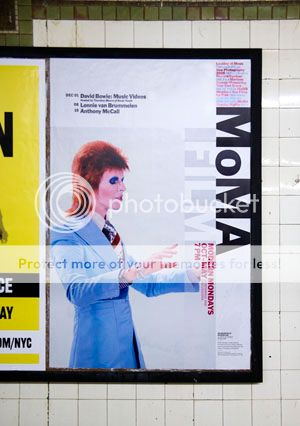
Michael Bierut's Pentagram firm is one of the best. They recently redesigned the promotional materials for MOMA, and in the article linked below discusses the redesign in detail. Go to the actual story to see some excellent examples of this process. Superb stuff here.

Along with the many signature artworks in its collection, The Museum of Modern Art (MoMA) possesses one of the most recognizable logotypes of any cultural institution in the world. In recent years, however, the application of this identity across the museum’s broader graphics program has been indistinct. Now MoMA has recast its identity, building on its familiar logotype to create a powerful and cohesive institutional voice. The new graphic identity has been designed by Paula Scher, and further developed and applied by Julia Hoffmann, MoMA’s Creative Director for Graphics and Advertising (and a Pentagram alumna).

While the MoMA logo is iconic, it alone is not enough to continually carry the spirit of the institution. An organized and flexible system was required that would support program material across print, web and environmental applications. The new system designed by Scher and Hoffmann employs prominent use of the MoMA logo as a graphic device, dramatic cropping and juxtapositions of artwork, and a brighter color palette to create a bold, contemporary image. The identity also underscores the museum’s leadership role in the field of design.

A look at the new identity after the jump. All pictured applications designed by Julia Hoffmann and her team at MoMA.

MoMA’s identity has been a landmark of institutional branding since 1964, when the museum introduced its distinctive Franklin Gothic No. 2 logotype designed by Ivan Chermayeff. In 2004 this logotype was redrawn in a new custom typeface, MoMA Gothic, created by Matthew Carter. The new identity system expands on this logotype, making MoMA Gothic the principal font for all typography. More importantly, the system creates a complete methodology for the identity’s application and handling across all platforms.

An appropriate scale and careful cropping were developed to make the identity more recognizable and powerful, and to create an attitude that modernizes the institution’s image. A strong grid has been established for the uniform placement of elements. Images of artworks appear whole or are cropped for effect. (Prior to this, the museum did not typically crop images of artworks.) The images are paired with the logotype, which has a consistent vertical placement similar to the signage on the museum’s façade. In most applications, one large image is selected as the focus, representing a current exhibition or signature work from the collection. A list of upcoming events unrelated to the featured image is organized into a text block.


Thursday, May 21, 2009

Hustwit's Plexifilm is the Indie Criterion


NOTE: I apologize for two Hustwit related posts in a row, but this is too good.

Gary Hustwit
's new company, Plexifilm, specializes in documentary and music films. They now are in charge of the first ever release of Warhol's films on DVD. From Plexifilm:

Released in conjunction with The Andy Warhol Museum, 13 Most Beautiful...Songs for Andy Warhol's Screen Tests features 13 of Warhol's classic silent film portraits. Subjects inlcude Nico, Lou Reed, Edie Sedgwick, Dennis Hopper, and more. Shot between 1964 and 1966 at Warhol's Factory studio in New York City, the Screen Tests are presented with newly commissioned soundtracks by Dean Wareham and Britta Phillips.

Tons and tons of great stuff here.

Objectified Opening In Atlanta Is Amazing


Went down to Atlanta last week to see the new Gary Hustwit documentary, Objectified. Being a big fan of Helvetica, I couldn't wait to have a chance to see his new film. It did not disappoint.

The film closely examines product and packaging design. Some of my favorite object designers are featured, including a few of my heroes: Apple's Jonny Ive and Ideo's David Kelley. Ive's discussion of the macbook design was revealing; the standard approach at Apple is, "how do we make this one piece function in as many ways as possible?". The keyboard base is build from one piece of aluminum, and houses the hard drive, motherboard, and processor. Watching Ive sit in the mysterious and exclusive Apple Labs and discuss many of the most beautiful designs to ever come from Apple. Awesome.

The tonal feel, editing style, and music are virtually indistinguishable from Helvetica. Whether you are familiar with alot of object designers or not, it is easy to get into the film. It is not overly packed with lingo; anyone can clearly understand the discussions, and the intimate shot styles bring the viewer in instantly.

When the film was over, I ran out the back door. I wanted to hit the restroom before Hustwit opened a Q&A session with the audience. The door flew open and I stepped right into Hustwit himself! I said hello, nice job, etc. and shook his hand. The Q&A that followed was superb, funny, and insightful.

A great experience overall. Objectified comes out on DVD in July - make sure you watch it, it is truly a must!

BTW - Thanks Jane for the tickets!

Wednesday, May 20, 2009

Building Excitement: HBO's Into The Storm


I am very excited about the coming HBO film Into The Storm. It chronicles the leadership of Winston Churchill during World War II. I've always been fascinated with Churchill, as he provided many of the most spine-tingling speeches known to man (We will fight on the beaches! We will fight in the streets! We will never surrender! - I'm paraphrasing btw). When I was young I spent alot of time reading about Churchill, and all WWII history. As an adult, I am torn about Churchill - though a brilliant leader for the British, he was absolutely brutal on the Irish and had no sympathy for their cause.

Anyway, the HBO movie stars the brilliant Brendan Gleeson (one of my favorite character actors) as the man himself. It should be great either way. It premieres May 31st at 9pm.

State Of The Art Bomb Spring Show 2009 Is Here


So ladies and gentlemen, it is that time of the year - the State of the Art Bomb Spring Exhibition 2009 is here. On Saturday, May 23rd the show will open, at exactly 6:13.

Lots of great artists will be represented, including: Diane Kilgore Condon, Paul Flint, Greg Flint, Katie Walker, Susan Young, Alexia Timberlake, Rebecca Stockham, Katy Cassell, Tim Cassell, David Slone, Mary Beth O'Connor, Jo Carol Mitchell-Rogers, Tim Speaker, Joseph Bradley, Teri Peña.

Come one, come all. And bring your checkbook!

Go here or here for more information.

Tuesday, May 19, 2009

Pacovolume: Weird Name, Great Video

PACOVOLUME "CookieMachine" from discograph on Vimeo.


This is awesome, just watch it. Great typography and a very original chorus. Now how can you resist that?

Ikea Lamp Commercial Makes Me Laugh


Just watch it.

Design Like You Give A Damn


Man, these are awesome. Lots more great stuff over at Design Like You Give a Damn.

Enjoy.

Alex Cornell Design Is Fantastic


Alex Cornell is a fantastic young designer. Yes, he is also the director of the Wes Anderson Film Festival trailer, which is gaining serious momemtum online.

Anyway, he has tons of great stuff here, or go directly to his superb portfolio here.

Good stuff my man.

Retrofuturs Posters Are Excellent


I have been spotting these online for the past week or so, and they are awesome. From Blog Like You Give A Damn:

I found these graphic posters via Stéphane Massa-Bidal’s Flickr

Stéphane says this about his work:

"My global concept is called “Retrofuturs”: mix the past, the present, the future and shake it! Before this concept has been contextualized with music (personal compilations with golden oldies, pop, electronic music etc…) with objects (lamps with retrofuturs graphics) and comics for my co-workers (it may be this which triggered the graphic concept)".

Have a peek at this Retrofuturs set here and according to the info on Stéphane’s profile page say that there will be prints available for these posters very soon!

Wes Anderson Film Festival Student Trailer Is Great

Wes Anderson Trailer from Alex Cornell on Vimeo.


Over at the awesome ISO50 site is the above video, directed by a student to promote the Wes Anderson Film Festival in Austin, TX. And it's fantastic. He then walks through the process of creating the clip, in superb detail. Jump over and take a look. Below is some detail concerning the film, but you really should just jump over and read it. Alex Cornell is an extremely talented man - take a look at his site, there are lots of great things there too.

BTW - More great Wes Anderson comparisons here.


It’s hard to believe, but somehow my spring semester is coming to a close this week. The film festival project, which I’ve written about previously, finally has all pieces completed and accounted for. The last element added into the mix was a festival trailer (shown above). Originally, I planned to create a few more ancillary products to flesh out the brand, but these fell through and I had to move on the trailer option late in the game. I teamed up with my friend Phil Mills, a local actor here in San Francisco, and we set about writing, shooting, and editing the film last Sunday afternoon.

We were allowed to base the trailer on just about anything we wanted, so long as it advertised our hypothetical film festival and carried through the visual style of our brand. There were a multitude of directions this could take; we thought the most fun way would be to shoot a Royal Tenenbaums-esque short, and then just throw as much craziness as we could at it. Phil plays T. Allen Fenway, a fictional character we made up to live in our Wes Anderson film festival world. We wanted it to remind you of Wes Anderson, make you laugh, and eventually turn you on to the festival. The 3rd person narrator, use of Futura Bold for all titles, extravagant setting, and full blown randomness were all utilized to aid in conjuring this look and feel.

Saturday, May 16, 2009

Music Video of the Week: The Strokes


The Strokes - You Only Live Once (Alternative Version) (Official Music Video)

Once upon a time (that long, long ago summer of 2001) The Strokes were the great contenders. They were viewed by the music press as the new saviours of rock n roll. At the time, the music industry was a barren landscape of mook rock (Limp Bizkit), vapid pop (Backstreet Boys) and crappy pop-punk (Blink-182). Was there ever a more ironically inaccurate term than pop-punk? Anyway, that's another conversation entirely...

The Strokes broke through into the mainstream, bringing The White Stripes (and others) along with them. But they never topped the promise of their superb debut, Is This It. The featured video (above) is a fantastic homage to Stanley Kubrick, and in particular, 2001: A Space Odyssey. Enjoy.

100 Great Album Covers


It's no secret that album cover art is the single greatest influence over me as an artist and designer. So of course I loved walking through these over at the excellent Smashing Magazine.

A Tribute to the Great Reid Miles


Reid Miles is one of my favorite designers of all time. His iconic work for the Blue Note record label remains in the lexicon of the finest work ever created. The (good in it's own right) Computer Arts magazine has a great article about Miles. For the entire article, go here. Here is an excerpt:

Reid Miles’s inventive use of type, moody photography and a minimalist colour palette helped Blue Note establish itself as the hippest of all jazz labels

Blue Note Recordings: the name still resonates today. Synonymous with artistic flair, the label is a fading memory of jazz’s ‘golden age’. Yet for all its musical importance, Blue Note was equally significant in terms of design. Under Reid Miles, the label’s sleeves formed a cornerstone of the graphic design canon.

Established in 1939 by Berlin-born Alfred Lion, Blue Note was an American label founded on love for an American art form. Intent on capturing the performances, Lion teamed up with Francis Wolff to realise his dream. Wolff was an accomplished photographer, whose moody renditions of jazz’s top cats adorned many early Blue Note sleeves. It wasn’t until the appointment of Chicago-born designer Reid Miles in 1956, however, that the label truly found its graphic voice.

Lion and Wolff refused to compromise creativity, allowing pioneers such as Thelonious Monk free reign to explore jazz’s cutting edge. It’s fitting that Miles’s first notable sleeve was a Thelonious Monk reissue (pictured above). Exploding onto the scene, his bold hyphenation of ‘Thelo-nious’ broke all the rules, treating the syllables as visual building blocks. Blue Note quickly became Miles’s playground; a space to challenge himself, artists and the audience.

Interestingly, Miles preferred classical music to jazz, trading in his Blue Note sample copies and not even listening to the music. Given this, it’s amazing that Miles’s designs were so ‘tight’. As Felix Cromey writes in Blue Note: The Album Cover Art: “Miles made the cover sound like it knew what lay in store for the listener: an abstract design hinting at innovations, cool strides for cool notes, the symbolic implications of typefaces and tones.”


Records Redesigned as Pelican Books = The Best


Man, these are the coolest things ever. Classic records lost in time and format, re-emerged as Pelican books. Seriously, I love these so much I cannot even tell you. Go take a look at them here. They are all cool.

Friday, May 15, 2009

Cormac McCarthy's The Road Looks Interesting


I have an odd weakness for post-apocalyptic films. You know, like the awesome Children of Men, The Road Warrior trilogy, etc. I don't know what it is that I find so interesting about them, but they always get my attention.

Children of Men truly is one of the most thought provoking films of the decade. An A-List cast (Clive Owen, Danny Huston, Michael Caine) combined with one of my favorite contemporary directors (Alphonso Cuaron) and a brilliant script come together to form a cohesive, aesthetic feast that kept the heart pumping and the brain turning from the opening frame until the last moment. Children of Men is that rare film that pulls you in and never lets go, staying with you long after it ends.

Cormac McCarthy's The Road finally has been come to the screen, and stars the underated Viggo Mortenson. Based on the trailer I am excited, even though the CGI looks very, very suspect. Take a look for yourself and see what you think.

Banksy Says What I Feel


Read this, it really says it all.

Type Nerds: Unite and Take Over


The role of the modern graphic designer/typographer has expanded into the public consciousness over the past several years, with the rise of "font-ism" and Helvetica. It seems that the general public now has a greater understanding of what type is (though not how to properly use it).

Even though the terminology is pretty off and constantly misused, these videos are still pretty funny.

Enjoy typenerds, enjoy!

Top 15 Fonts for Packaging Design

Great article over at the ubiquitous Dieline called the Top 15 Fonts for Packaging Design. Lot's of great stuff in it - it really is a must read.

Some highlights:

Keep # of Fonts to a Minimum. Try to keep the number of fonts on a package at 2-3 typefaces total. It's best to keep the number of fonts used in a design to a minimum. Sometimes there are exceptions, but use your best judgment.

Kerning is Mandatory. No font, no matter how expensive or good it is, is immune to irregular kerning. You should always double-check the spacing between letters to make sure they're even. This will make the difference between amateur design and professional work.

Fonts are Not Infallible. If a specific letter looks weird or somehow 'off', use your judgment to repair or replace it. Some fonts (especially hand-written scripts and free fonts) have strange-looking characters. You should use a critical eye and replace or tweak a character until it looks right.

Readability is King. If you can't read it, it probably doesn't belong on packaging. Again, there are exceptions to this rule, but it's rare. No matter how 'cool' a font is, if you can't read it, the package is handicapped in conveying its message - what's inside and why you should buy it.

Sound advice for all!


Thursday, May 14, 2009

Oliver Munday Design Is Clever, Great


Tons and tons of great work over at Oliver Munday Design. Take some time and check it out.

Monday, May 11, 2009

Art Chantry: True American Master


When I was in graduate school my good buddy RyNy lent me his copy of Charlie Don't Surf: The Graphic Design of Art Chantry. I was totally blown away - here was a designer working in the punk/DIY aesthetic, creating unique textures, using the copy machine as an artmaking tool, taking risks with typography, and working the limitations of the xerox in original and beautiful ways.

It was Chantry who really brought home the idea for me that one should only utilize color when it is absolutely necessary, and that if used sparingly, that color could impact the viewer in startling and significant communicative relationships. As an artist and designer, there was two periods of my career BC and AC - Before Chantry and After Chantry.

One of the hardest items I've ever had to return to someone was that Chantry book, as it's very hard to find and very expensive, even on Amazon.com. But it's a book that every designer should come in contact with at some point, and Chantry is certainly a "must see" designer to be examined. There are many, many lessons to be learned from his craft.

A true American master, Chantry is an artist that was never given the proper respect he deserved. A million, trillion imitators have come in his wake, with precious few even being cognizant of who they were ripping off.

Do yourself a favor and spend some time with his work - Chantry has an excellent website here. Here's to you Art Chantry, you are one of the best.

Saturday, May 9, 2009

Exit Calm EP Finally Released

British band Exit Calm are one of my favorite bands in the world, and as I previously mentioned, have not had any officially released material to purchase until now. The On Our Own EP is available via itunes, but has sold out in the physical realm.

The EP comprises a single cut of On Our Own, as well as a full length, seven minute, proper version of the track as well. Additionally, the EP also features an acoustic version of Atone, a song which has not appeared in any form previously.

Anyone who likes early Verve, Spiritualized, or other shoegaze bands will love this EP, and Exit Calm as well. A ferocious live band, it is great to hear them in the studio. This EP is superb - I can't wait to hear the full album. Buy it now.

Friday, May 8, 2009

30Rock: As Funny As Mainstream TV Gets

I’ve given it enough time (you know, that probationary status you afford a new TV show/band/artist/website before you make your mind up about their standing) and can confidently say, 30 Rock is the funniest show on mainstream television.

30 Rock requires a little bit of time to fully “get” the tone of the show. The rapid-fire editing and constant asides take some getting used to.

This truly is an ensemble cast, but Tracy Morgan always, always maximizes his screen time, bringing the odd charm he occasionally brought to SNL. Alec Baldwin is laugh out loud funny, often poking fun at his appealingly smarmy executive magnetism. Of course Tina Fey makes the whole thing move, constantly referencing herself, self-deprecating and witty.

I will leave you with this quote:

Tracy: "Werewolf bar mitzvah, spooky scary. Boys becoming men, men becoming wolves."

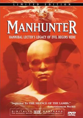
Manhunter: Mann's Little Seen Masterpiece


Michael Mann is one of the strongest contemporary directors. He originally made his name as the creator and director of Miami Vice. Miami Vice was an extremely innovative show, well ahead of its time and has actually aged much better than one would imagine. It was an oddity for a television show, oftentimes running from commercial to commercial without any spoken dialogue. Mann is a master at creating a mood through the usage of composition, color, sound design, and most effectively, with music. Everyone knows the famous In The Air Tonight sequence – extreme angles, silence, drums pounding, etc. Here it is – it is basically a two minute distillation of everything Mann is known for stylistically.


Mann utilizes the entire frame in a way that most modern directors do not. The frame is alive through dynamic composition, emphasizing contrast and asymmetric arrangements of space. Perhaps more than any other director currently working, Mann’s work must be viewed in the widescreen format. Every frame of Manhunter works as a fully functional, lively composition.


Additionally, the cinematography is hyper-realistic, adding a glossy glamour that retains a gritty realism, a dichotomy that really needs to be viewed to be fully appreciated.


Though the entire series revolves (to one degree or another) around Hannibal Lecter, Manhunter entirely belongs to William Peterson. His Will Graham is a tour-de-force, career defining performance. In Peterson’s hands, Graham is a palpably haunted character, a man who engaged in the deepest, most sinister regions of the human soul in order to try to think like a killer. The price of that journey has left him ghostly, scarred, a shell that is devoid of his previous identity.


In the end of the film Will Graham has to kill The Tooth Fairy, not only to defeat an evil man from performing another malicious deed, but also to kill the malevolence living inside of him, a horror Graham had to become (at least internally) like the ghastly Hannibal Lecter in order to catch him. The odd jump cuts that occur when Graham shoots the Tooth Fairy very obviously deviate from the tonal editing of the remainder of the film, and for good reason. The mirror/shattering of self motif works throughout the entire film, but it is the jump cuts at this precise moment that offer another visual “shattering”; by killing The Tooth Fairy/evil inside himself, Graham literally shatters that internal evil, and thereby regains his own identity, an identity in peril since his tracking of Lecter. This is reinforced immediately following the death of the Tooth Fairy, as the potential victim (who is blind, yet another visual metaphor) asks Graham “Who are you?’ – Graham, in thoughtful tone, responds “Will Graham, I’m Will Graham” as much to the victim as to himself.


From Wikipedia:


Because William Petersen's role was so emotionally exhausting, he did everything he could to rid himself of Will Graham after principal photography wrapped. Petersen shaved off his beard, cut his hair and dyed it blonde.


In retrospect, Manhunter is the strongest of the Lecter franchise films. The remake, Red Dragon featured an A List cast – Ed Norton as Graham, Anthony Hopkins as Lector, Ralph Fiennes as The Tooth Fairy, and the always great Philip Seymour Hoffman. Despite the advantages such a cast should offer, Red Dragon is merely a decent film directed by the ham fisted Brett Ratner, who sanitizes any significant instinctive impact on the viewer. In its place is Nine Inch Nails-video style serial killer shots, nudge nudge – wink wink glances from Lecter, and another wooden performance from the occasionally brilliant Ed Norton who merely phones it in.


Manhunter is a landmark film that supersedes the serial killer genre. Mann has other masterpieces (Heat, Last of the Mohicans), but it is Manhunter that should be the film he is most known for, yet remains his most little seen film. Do yourself a favor and check it out.