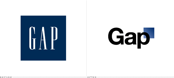
The old logo for the Gap was nothing special - condensed type on a blue square, kind of boring and late 80's but not really awful or great. It was just kind of there. I recently noticed their usage of Helvetica for their 1969 Jeans campaign, and was super impressed with the quality and minimalism utilized there.
So when I saw the new logo, I was not surprised to see Helvetica, but what I was shocked to see was the terrible, horrifyingly bad blue gradient square tucked partially behind the "p". Wow, wow, wow. This looks like it was done in Windows, or Microsoft Word. It looks like a high school student redesign project, where the feedback to the young, inexperienced student would go something like this:
"While I applaud your desire to connect to the successful 1969 Jeans campaign by utilizing a concise, communicative face such as Helvetica, usage of gradients should be sparing and carefully selected. There are few times such an effect is warranted, and this truly is not one of them. I am not sure what you are attempting to communicate to your audience through this execution. For revision, eliminate any elements that are not essential and do not clearly support the message you are attempting to execute. Please continue to revise."
Take heed friends, this is what an Epic Fail looks like.
