Tuesday, June 28, 2011

New M83 Album Trailer Looks Expansive


M83 is one of those bands that you really like, but aren't crazy about until you see them live, and everything changes. I saw them a couple of years ago in Atlanta and they were absolutely phenomenal. At the time they were touring behind their epic last album, Saturdays = Youth. A truly stellar album reached vast new heights in the live setting. In short, their performance took me from liking them to loving them.

Their new double-album is to be released in September, but just to tide us over M83 mainman Anthony Gonzalez has just released this trailer. All indications point to another amazing album.

Stay tuned for more.

Apollo 18 Looks Interesting, Creepy


Apollo 18
is a new film with a very interesting premise - that the planned Apollo 18 mission that was cancelled really did happen, and that the evidence from that mission has only now been revealed.

From Moviephone:

Officially, Apollo 17, launched December 17th, 1972 was the last manned mission to the moon. But a year later, in December of 1973, two American astronauts were sent on a secret mission to the moon funded by the US Department of Defense. What you are about to see is the actual footage which the astronauts captured on that mission. While NASA denies its authenticity, others say it's the real reason we’ve never gone back to the moon.

Sounds interesting. To be released in August.

BLK/MRKT Editions Brings The Cool


BLK/MRKT Editions sells limited runs of various prints from great artists and graphic designers. There is lots of great stuff there to buy, like these super cool plates - and that is not a sentence I thought I would ever say.

Find them here.

New Bohemia Signs Are Utilitarian History


The sign painting business is becoming a lost art. But New Bohemia Signs in San Francisco is keeping that tradition alive by creating fresh, retro-inspired signage for businesses in the Bay Area. One of the things I like best about them is that they recognize the artistry of the practice, and sometimes present their craft in galleries as art.

From New Bohemia Signs:

Welcome to New Bohemia Signs. We are designers and sign writers who appreciate the art of a good looking hand-painted sign. Our work can be seen all over San Francisco, please take a look at our portfolio and flickr set. You'll be surprised at what you recognize. An attractive sign is much more likely to draw customers into your business and beautify your neighborhood at the same time. New Bohemia has been hand-painting signs since 1993.

I really encourage you to follow the above links to their flickr set in addition to their site. Tons and tons of exquisite work to be found there. Or start here at their superb site.

Friday, June 24, 2011

Summer Recommendation: The Man Who Fell To Earth


Coming out of the Space Race era of the 1960's, Science Fiction seemed to arrive into a golden age in the 1970's. The Star Trek franchise had already begun in earnest (along with Lost In Space, The Twilight Zone and other campy TV shows), and David Bowie had reached superstardom through the creation of his Ziggy Stardust persona. By decades end Sci-Fi had become family entertainment through the massive success of Star Wars and Close Encounters of the Third Kind, a trend that would gain considerable steam in the 1980's era of the blockbuster - E.T., The Terminator series, etc.

Yet there was another, more philosophical branch of science fiction that produced two of the finest examples of the genre, Andrei Tarkovsky's Solaris in 1972 and Nicolas Roeg's The Man Who Fell To Earth from 1976. Both films are fine examples of what is important about the Sci-Fi genre - the ability to work in metaphor to explore diverse themes through unique vantage points. These two films are the gold standard for quality, ideological exposition, a bar that few other films - Blade Runner, 2001: A Space Odyssey - also reach.

Director Nicolas Roeg approached Bowie concerning a role in his new film just as Bowie was in the midst of an extremely tumultuous period - having "killed" his Ziggy Stardust persona, he then took on the role of a demon for the visceral Alladin Sane album. Quickly tiring of Alladin Sane, Bowie then took brief excursions into minor characters - Halloween Jack (who came out of his scraped attempt to stage a Nineteen Eighty-Four-themed album and tour, the leftovers then became the Diamond Dogs album - he can be seen in the Rebel Rebel video here), and the Jean Genie (an Elvis-y, rockabilly alien who only existed for the video essentially).

At this point Bowie turned another 180 degrees for the "fake plastic soul" of the Young Americans album, which proved exceptionally successful in terms of financial rewards but did little for Bowie in terms of artistic satisfaction, a situation exacerbated infinitely by his absurdly over-the-top cocaine addiction. For a few years Bowie went through a mental and spiritual breakdown fueled by the rapid succession of living as different personas, essentially acting in roles that continued beyond the stage and into real life. This blurring of personalities caused Bowie to begin to act psychotically, existing solely on milk, peppers, and cocaine while becoming deeply involved in the occult.

The Man Who Fell To Earth would provide Bowie with yet another role to inhabit, but would also allow him to work within film, a new artistic medium for the first time that carried the promise of that which Bowie craved most - artistic evolution. This was the lure that brought Bowie into the film.

What is The Man Who Fell To Earth all about? From Criterion:

The Man Who Fell to Earth is a daring exploration of science fiction as an art form. The story of an alien on an elaborate rescue mission provides the launching pad for Nicolas Roeg’s visual tour de force, a formally adventurous examination of alienation in contemporary life. Rock legend David Bowie, in his acting debut, completely embodies the title role, while Candy Clark, Buck Henry, and Rip Torn turn in pitch-perfect supporting performances. The film’s hallucinatory vision was obscured in the American theatrical release, which deleted nearly twenty minutes of crucial scenes and details.

The film is a brilliant, and subtle exploration of the state of modern man, of the inevitable existential loneliness of the human species. Bowie is simply magnificent as Thomas Jerome Newton, an alien to earth who finds himself no less susceptible to the failings of man. All of the chaos around his personal life found its way into every frame, as Bowie projected alienation, disillusion, and loss - mostly silently without lines. Superb.

Another aspect that I like best about the film is that Roeg does not shy away from pushing the viewer into uncomfortable spaces - and this film certainly does that. Not for the faint of heart - though had you seen the film prior to the last couple of years (when Criterion gloriously restored the film) you would have viewed a badly truncated version that left out all of the pathos of the characters due to cuts by the censor board.

I really don't want to say much more and spoil anything for you. Check it out this summer, it is an off the beaten path cult classic that has much to offer the viewer should you choose to spend the time with it that it deserves.

As a final aside, I would like to also point out that the thought-provoking portion of the Sci-Fi universe lived on last year in the brilliant Moon, written and directed by Duncan Jones, the son of - you guessed it - David Bowie. So enjoy that too when you can.

Thursday, June 23, 2011

Are You A Mac Or PC Person?


Are you a Mac or PC person? This is a pretty standard question nowadays. Me? Yes, I'm a Mac person, to the bone.

Now there is hard data about the differences. It is very interesting, if a bit expected. Worth taking a look for the great infographic.

Check it out here.

Wednesday, June 22, 2011

Quote Of The Day: Octavio Paz

Another great Modernism quote from the brilliant Octavio Paz. I think Modernism is starting to make a bit of a comeback.

Bracket Magazine Is Exquisite In Print, Digital


Bracket Magazine is a new art and design oriented magazine specifically designed for both print and digital editions. The print version is $15, while the digital is only $3. This model I believe will become the standard publishing practice for most magazines in the near future, as the printed "artifact" will move to a premium cost, while the digital will become the emphatic publication itself.

From Bracket:

Bracket is conceived as a publication that features everything in between – ideas, voices and processes that are overlooked and under-appreciated. Brackets are commonly used as parentheses in writing to add supplementary information – containing materials that are seen to be dispensable without destroying or altering the meaning of a sentence. The publication covers topics that in modern day, have become seemingly dispensable.

They have an absolutely exquisite sense of typography at Bracket. And the site is great too.

Check them out here.

Wim Crouwel Mini-Doc Is Important, Inspirational


Wim Crouwel is not only an important graphic designer, but a significant thinker. What I mean by this is that his modernist aesthetic is truly an extension of his worldview, which is to approach all things with the economy of deliberate purpose. It is this philosophy that is so vital to not only design but to all things produced, created, or utilized.

Submarine Channel (no relation to the post below) has produced this wonderful mini-documentary about the living legend. The real treat here is to listen to Crouwel discuss his work at the retrospective of his design in Switzerland. The man is a treasure.

Do yourself a favor and spend 10 minutes to watch it. Sorry to make you jump over there, but you will be glad that you did. Since they do not allow embedding, go here to check it out.

Submarine More Than A Solid Tribute To The New Wave


The trailer for the new film Submarine looks fantastic, referencing much of the French New Wave cinema in the editing, sound, shots, color, and even typography, much like Jean-Luc Godard. In other words, it looks great. It also features original music from Alex Turner of the Arctic Monkeys, which also should be cool.

Currently making the rounds at festivals and a wide European release, Submarine should come to America soon I hope.

Submarine also has a fantastic companion site. Go here to check it out.

Sunday, June 19, 2011

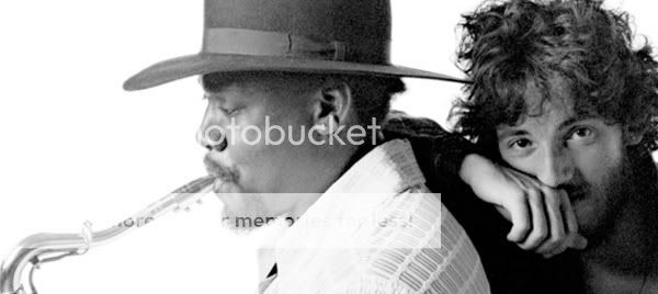
Heroic Sideman Clarence Clemons Dead At 69


It seems that when some individuals die, their death seems incomprehensible. Not just because they were strong or larger than life, but because some people just seem invincible. Icons. Blocks of granite. Cornerstones. Tougher than the rest.

Clarence Clemons of the legendary E Street Band was certainly one of those. In my youth rock stars were more like comic book characters, superheroes that sometimes walked amongst the mortals on earth, I took notice of the Big Man (his nickname). I remember watching his ebullient, charismatic smile in Born In The USA era videos on MTV, somehow feeling like I knew him. He was familiar to me, like I had seen him before, like I somehow had already grown to feel great love for this person that I didn't actually know at all but merely smiled back at me through the TV screen.

Now looking back on it, I wonder how much of my own notion of what friendship, of what brotherhood actually looks like was formed from those videos. And the best visual example of what a bond between brothers looks like has to be the cover of Born To Run. The Boss and The Big Man, leaning back to back, an image that spoke volumes; this is what brothers look like. For someone who didn't have a brother, I think that this image taught me what that word - brother - looked like, and in fact, what the word meant.

The other aspect of his legacy is of course the music itself. To be honest, I rarely like horns in rock and roll, and I especially dislike the saxophone in general. But Clemons' sax was always different. Rather than the cringe I normally felt when a horn might come into a song, I felt a twinge of excitement whenever he stepped to the plate. His playing was totally distinct, more soulful, more celebratory, more spiritual than any other sax player in rock history. From the desperate ache of Drive All Night, the cinematic widescreen reach of Jungeland, the broken-hearted wail of 41 Shots, to the out-in-the-street summer bounce of Tenth Avenue Freeze Out or Livin' In The Future or Sherry Darling, the sound of that horn could take you all over the city, a geographic resonance.

Thank you Big Man, for all those lessons and all that beauty. Thank you for all the nights I have spent sitting in an open window overlooking the city as the warm summer breeze filled the room. Thank you for providing the soundtrack to the streets of the Saginaw of my youth, at least in my mind.

You always were too big for this world.

Saturday, June 18, 2011

Criterion Brings Immortal Solaris To Blu-Ray


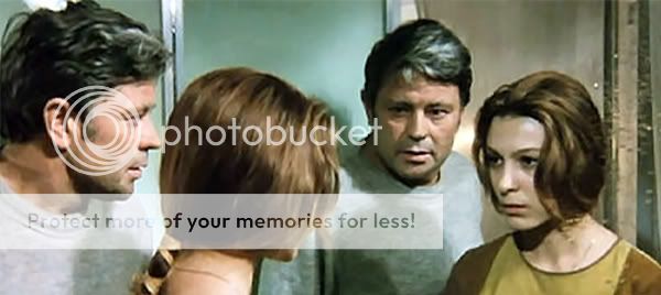
Filmmaker/Certified Genius Andrei Tarkovsky created a small, but exceptionally powerful group of films in his lifetime. One of his greatest - Solaris - has recently been issued on Blu-Ray for the first time by the incomparable Criterion Collection. A stunning visual feast, the improved image resolution brings to life Tarkovsky's futuristic vision as never seen since the release in 1972.

Why should you go out and buy it? What is so special about Solaris? Here is a brief synopsis from Criterion:

Ground control has been receiving mysterious transmissions from the three remaining residents of the Solaris space station. When cosmonaut and psychologist Kris Kelvin is dispatched to investigate, he experiences the same strange phenomena that afflict the Solaris crew, sending him on a voyage into the darkest recesses of his consciousness. With Solaris, the legendary Russian filmmaker Andrei Tarkovsky created a brilliantly original science-fiction epic that challenges our conceptions about love, truth, and humanity itself.

But that is only half the story. Like the other works of Tarkovsky (especially the brilliant Stalker) much of the film centers around psychology, and will continue to haunt you long after the final frame.

Go to Criterion and buy it here.

Side Note: Steven Soderbergh remade the film in 2002 with George Clooney in the lead role. While it was an admirable take on the original source novel, it is an exercise in futility to attempt a remake of such a monolithic, classic of film history.

Just Kids Is A Moving Tribute To The Artistic Spirit


Patti Smith is one of those untouchable icons, like Bob Dylan or David Bowie or Iggy Pop or Lou Reed. Those icons that seem so enormous, their work so unassailable, that they don't even seem like people anymore but rather have become symbols, referents to certain larger ideas. They themselves have become metaphors for distinct ideals that we observers can only reference, draw inspiration from, or warm our own creative spirits beside their primordial, immortal fires. They are too colossal to be people; they are simulacrum.

When Patti Smith published her memoir last year - Just Kids - I was immediately interested. Smith had long been a hero and influence on my life and work, and I was intrigued with the opportunity to hear her story in her own words. I was disappointed to learn that the book was written as a tribute to her friend, muse, and sometime lover Robert Mapplethorpe. While I certainly respected Mapplethorpe and his vaunted position in the art world, I was dismayed that the story would not be more centered on Smith herself.

Now having completed the book, I must say that my expectations were completely wrong. Just Kids is a fascinating account of the New York City from the mid-Sixties Warhol / Velvet Underground / Chelsea Hotel through the mid-Seventies, down and dirty / CBGB's / Punk scene - in other words, the NYC of my dreams. If I could have lived at anytime in history, in any place, I would have lived in New York City anytime between 1965-1985. And Smith's book is as much about the atmosphere and ambiance of the art and music scene of that era as it is about Mapplethorpe, or herself. Indeed the book is wonderful, as it presents the period as being magical but not without flaws.

In fact Just Kids is about two innocent, kindred spirits attempting to navigate the ruthless NYC art scene as well as themselves. An odyssey of discovery to find who they really were, and building the courage to live out loud as the people they truly were through the encouragement and positivity of the other. For Mapplethorpe this struggle was to first be comfortable with his homosexuality, then to live openly as the person that he truly was, free from guilt or shame - a transition that allowed him to explore his most significant and ground breaking work. For Smith, this process was about drawing from powerful male influences (Dylan, Rimbaud, Morrison) to form a launching pad from which she would explode as the epicenter of the CBGB's punk scene. Indeed, both Mapplethorpe and Smith were trailblazers, and Just Kids brings to the fore how each supplied the other with what was needed to break new ground - acceptance, understanding, and unconditional love. In this way Just Kids is a love story in the truest sense of the words.

If you are an artist, musician, writer or simply lover of those mediums, then Just Kids is a must read. Smith is such an engaging writer that even if you are not familiar with their lives and work, the read is charming and endearing.

NY Times review is here. Buy it here. You will not regret it.

Friday, June 17, 2011

Francis Ford Coppola Interview Is Inspirational


Francis Ford Coppola directed some of the finest American films ever made, including The Godfather, The Godfather II, The Godfather III, The Conversation, Apocalypse Now, Rumble Fish, and The Outsiders. A true maverick, Coppola bet everything he had on his own Zoetrope Studios in the early 80's, and lost it all. The Detroit born auteur has long been a hero of mine as well.

Inspiring then that he is in the midst of his own career renaissance. Recently the awesome 99% sat down for a discussion with Coppola about film, art, life, and resilience. And the interview is truly inspiring.

Read it here.

The Wire Is The Greatest Show In Television History


I heard it for years, over and over. Anytime I read about or heard anyone speak about the HBO show The Wire, the same phrase was always, (and I mean always) mentioned immediately; "The Wire is the best show in history". And it wasn't just the critics that I read making this claim, but also a few of my closest friends whose opinions I respect greatly echoing that same sentiment. It seemed there were two types of people - those who had seen The Wire and claimed it to be the best show in history, and those who had not yet seen it.

So for years I have been wanting to watch it, and never seemed to be able to get my hands on it. Until now. Thanks to HBO GO (which is amazing, and potentially life-altering) a service that allows on-demand viewing of all HBO shows in history, available on your iPad or computer if you subscribe to HBO. Suddenly all shows, all seasons are now open to be explored. And the first night that I downloaded HBO GO, I watched the first episode of The Wire.

The Wire is incredible for many reasons, but one of my favorite is the characters. Genuine, accurate writing combined with truly phenomenal actors blend to create a realism unseen in any television show or film that I have seen. Added to that mix is the spice of true life, non-actors from the mean streets of Baltimore that only lend more weight to the atmosphere of authenticity that permeates every aspect of the show.

Omar is one of the greatest, most original characters in history, and he is not even the "star". The characters are phenomenal, played with passion and believability. Why isn't Dominic West (McNulty) a star? Why isn't Wendell Pierce (Bunk) a household name? If I was a Hollywood executive, I would be hiring these actors immediately. Though HBO was wise enough to cast Michael K. Williams (Omar) in the fledgling Boardwalk Empire and Wendell Pierce in the struggling Treme we really need to see more of their vast talents.

But it is more than a pseudo-documentary. It is epic in scope, viewing the city from several seemingly disparate vantage points (from police to drug dealers, teachers to longshoremen, government administration to junkies) that when viewed as a whole, come into focus as an interconnected entity called Baltimore.

With confidence I can assert that yes, The Wire is the best show in television history. But it is more than that - it truly is a "visual novel" as some critics have described it, every bit as sweeping as The Godfather mixed with the gritty legitimacy of a documentary. The Wire supersedes television - it is too big for that small of a medium. No, The Wire is something else, something more significant than what we refer to as "TV".

Long live The Wire - the best show in the history of television.

Wednesday, June 15, 2011

Flying Junction's Vintage Subway Signs Are Living History


I have long been a fan of the signage of the NYC Subway system. From their early days, through their absolutely perfect Vignelli-designed 70's incarnation, through to today, much of the signage has been and continues to be a living, breathing work of art as environmental typography. AIGA has a brilliant article about the evolution of the NYC Subway system here.

Ace Harrison also loves old subway type, which is what drove him to begin faithfully recreating it for his Flying Junction company.

From Flying Junction:

A Flying Junction is a railway junction at which one ore more diverging or converging tracks in a multiple-track route cross other tracks on the route by bridge to avoid conflict with other train movements. My prints and canvas signs are inspired by original subway signs and bus scrolls dating back to the early 1900's. I use hand-lettering techniques to create authentic, vintage looking reproductions of the original signs and scrolls. I believe that taking the time and care in my work to come as close to the originals as possible gives the viewer a more powerful feeling of connection with the cities and times represented.

They are relatively inexpensive - $19 through $129. And wow, do they look legit.

Buy them here.

Derringer Cycles Are The Coolest Thing On Two Wheels


In the past I wrote about the RatRod cycling industry, and the inspired retro-styling of RatRod bikes. Derringer Cycles utilizes some of the same vintage styling but goes to a new level through their products.

Derringer Cycles are absolutely more motorcycle than bicycle, and the difference is obvious upon first glance. The designs are absolutely gorgeous, and by all reports they are all around killer machines to ride. And like alot of other great inventions from history, necessity was the mother of invention in inspiring their function.

From Executive Edits:

Derringer Cycles neo-classical interpretation of the old board track racers, place the rider in an aggressive riding position without compromising safety. In this way, style plays a more active role in the vehicles function. “You feel as though you are riding 100mph when in reality you are moving much slower.” In truth, a custom Derringer tops out at 35mph. They have a lot of torque and are quicker. Lighter. “A Derringer Cycle has ‘it’ when it comes to mopeds”.

For lots more, go here. Also, Executive Edits has a great interview with Derringer Cycle maker Adrian Van Anz - go here to check it out. It is a very worthwhile read.

Tuesday, June 14, 2011

Quote Of The Day: Massimo Vignelli

Minimalism is not a style, it is an attitude, a way of being. It's a fundamental reaction against noise, visual noise, disorder, vulgarity. Minimalism is the pursuit of the essence of things, not the appearance.

Massimo Vignelli

The Scout Interview With House Industries Is Necessary


House Industries is one of the most innovative type foundries operating today. I have long been a huge fan of their retro-contemporary approach. Recently The Scout sat down with House head honcho Andy Cruz to discuss their practice.

Great stuff. Read the complete interview here.

Summer Film Recommendation: Paris, Texas


I don't know what it is about summer, but I find that I really like to watch alot of films during that season. Maybe it is because I live in South Carolina now and can't watch the Detroit Tigers everynight (they aren't broadcast down here), but I find myself watching even more films than normal from June until August. So I thought I would make some Summer Film Recommendations.

The first film I would like to kick off this column with is the brilliant Wim Wenders film Paris, Texas. The film won the Palme d'Or at the Cannes Film Festival in 1984, was written by the superb Sam Shepherd, and features a subtly beautiful soundtrack written and performed by the legendary Ry Cooder. It features the incredibly underrated Harry Dean Stanton and Natassja Kinski as well as Dean Stockwell and Aurore Clement in career defining performances.

From Wikipedia:

The film stars character actor Harry Dean Stanton as Travis, who has been lost for four years and is taken in by his brother (played by Dean Stockwell). He later tries to put his life back together and understand what happened between him, his wife Jane (Nastassja Kinski), and his son Hunter (Hunter Carson)...Paris, Texas is notable for its images of the Texas landscape and climate. The first shot is a bird's eye-view of the desert, a bleak, dry, alien landscape. Shots follow of old advertisement billboards, placards, graffiti, rusty iron carcasses, old railway lines, neon signs, motels, seemingly never-ending roads, and Los Angeles, finally culminating in some famous scenes shot outside a drive-through bank in down-town Houston. The cinematography is typical of Robby Müller's work, a long-time collaborator of Wim Wenders...The film is accompanied by a slide-guitar score by Ry Cooder, based on Blind Willie Johnson's "Dark Was the Night, Cold Was the Ground".

That description describes the tangible objects and locations in the film, but does not describe the incredible atmosphere created through lighting, pacing, and music. The film does not look or sound dated in the least; in fact it looks as if it may have just been released due to the clarity of the cinematography, the way the each frame looks like a sublime, magical-realism photograph.

And the performances are staggering, painful and moving. The scene between Travis and Jane is one of the greatest in cinema history. I don't want to say much about it to spoil anything for you, but if you still have a dry eye at it's close then you may need to check yourself for a pulse.

Paris, Texas is an achingly beautiful meditation on the existential, inevitable distance between human beings. A truly unique film experience. If you have some time this summer, check it out.

Monday, June 13, 2011

If You Crave Good Design, Look For Crave Collective


The good people over at Crave Collective - Phil Belger, Jivan Dave, and Kelly Johnson are hungry. Hungry for design, for art, for life.

From Crave:

We are Crave Collective, a tight trio of creatives who share a passion for design, photography, printing, and culture. We're ready to feast on the smorgasbord that is the world.

Need something designed? Why not get these design-sleuths on it? I can vouch for their talent, but now you should hire them. Good design by good people.

Go here to get yer Crave. I highly recommend them.

This Is Display Is The Most Beautiful Site Possible


This Is Display is:

Display is a curated collection of important modern, mid 20th century graphic design books, periodicals, advertisements and ephemera. Documenting, preserving and providing public access to these original materials will raise the profile of Graphic Design as a source of educational, historical and scholarly analysis for teachers, students, designers and independent researchers. From the rational to the experimental to the playful – our collection is varied and represents a distinct point of view about mid-century graphic design, typography and beyond.

This seriously is the most beautiful site that I have ever seen before. I worship at it's feet...ugh, it's so perfect. Created by the geniuses over at Kind Company. It is so good it makes me physically ill, a little woozy and nauseous. No, really, it is that amazing.

Just go there.

New TIMSPEAKER.COM Is Finally Active


After several weeks of work, the new timspeaker.com site is up, featuring much new work. The site is not fully populated yet, but I will continue to add material as I finish preparing it. Virtually all of the Art galleries are up and functioning, but the Design galleries might take awhile as I track down old files and projects. Too much moving around the country tends to cause items to disappear over time.

Big thanks to Jivan Dave (of the illustrious and aforementioned Crave Collective) for his assistance in helping get my feet wet with Cargo. Check out his killer new site here.

In the meantime, please visit the new and improved timspeaker.com.

Wieden+Kennedy Give Simple, Sage Advice


Wieden+Kennedy are an amazing design firm out of Portland OR. Their creative director recently shared his 10 Lessons For Designers.

From Swiss-Miss:

John C. Jay, Wieden+Kennedy’s executive creative director, offers some thought-provoking ideas about design:

1. Be authentic. The most powerful asset you have is your individuality, what makes you unique. It’s time to stop listening to others on what you should do.
2. Work harder than anyone else and you will always benefit from the effort.
3. Get off the computer and connect with real people and culture. Life is visceral.
4. Constantly improve your craft. Make things with your hands. Innovation in thinking is not enough.
5. Travel as much as you can. It is a humbling and inspiring experience to learn just how much you don’t know.
6. Being original is still king, especially in this tech-driven, group-grope world.
7. Try not to work for stupid people or you’ll soon become one of them.
8. Instinct and intuition are all-powerful. Learn to trust them.
9. The Golden Rule actually works. Do good.
10. If all else fails, No. 2 is the greatest competitive advantage of any career.


Quipsologies Is A Design Think Wonderland


Quipsologies is a site where designers can post something they find noteworthy or interesting in the world of graphic design.

From Quipsologies:

Quipsologies, is a division of UnderConsideration, chronicling the most curious, creative, and notable projects, stories, and events of the graphic design industry on a daily basis.

The site is kind of a bottomless pit of awesome. Go there if you need to kill like 50 hours of your life.

Quipsologies is here.

MOMA Goes Cargo For Their Superb New Site


The Museum of Modern Art in NYC recently unveiled their new site for their Department of Advertising and Graphic Design. The team works in house to design the entire exhibition space and campaign behind their special installations.

From MOMA:

...a selection of our recent exhibition designs, advertising campaigns, and printed materials—all produced for and in collaboration with the Museum’s many departments, from curatorial to education to visitor services.

Not only does the work on the site look phenomenal, but the site design itself is also tremendous. Of course they chose to utilize the Cargo Collective interface, which is also what my new site - timspeaker.com - is also accessing. Cargo is brilliant and beautiful, like a designer-ly Penelope Cruz.

Check out the MOMA site here. Check out Cargo here.

Lost Type Is The Future Of Typographic Distribution


The Lost Type Co-Op is the first site to offer type designers an outlet to sell their work, in a pay-what-you-want format. Designers can sell their newest face in a great environment, where others will utilize their face and pay for it accordingly. Sounds great all around.

As Radiohead proved last year, this new model for selling your art can be successful. Even Panera cafe has attempted a pay-what-you-want model for some of their stores, and the experiment has proven so successful that they are opening more every month.

I believe that this will become more the standard for many products, especially within the artistic disciplines. Not only do artists become compensated for their work, but it seems an honest way for all people who enjoy a product or service to be part of their transactions in a more meaningful way.

I hope that this trend continues. In the meantime, go here to check out Lost Type.

Kind Company Makes Beautiful Virtual Things


Kind Company designs websites, printed materials, and identities. And seriously, there is nobody better in a business chock full of talented people.

From their site:

Kind Company is a small, 2-4 person, independent web and print design office in Brooklyn, New York. Since 2004, partners Patricia Belen and Greg D'Onofrio have been using design as a tool to help small to medium sized businesses communicate their ideas, products and services.

Check them out here - their is a ton of amazing work to be found there. The website design work is absolutely to die for.

Sunday, June 12, 2011

Please Be Patient, Excuse My Digital Dust

Hey there loyal readers. As you may have noticed, there are many changes afoot here at Speak A&D. These changes are in accordance with the fresh new redesign of timspeaker.com. I want to beg your patience for the blog redesign that I am currently working on. This may cause things to be a bit chaotic here for a bit, but please bear with me.

If you haven't stopped by timspeaker.com in awhile, please do, as it is a totally new home for my work.

Thank you for your understanding and support.

Alexander McQueen At The Met Is A Fitting Requiem

Alexander McQueen: Savage Beauty Pt. I from RUNWAY PASSPORT on Vimeo.

Alexander McQueen, who referred to himself as "the Edgar Allen Poe of fashion" committed suicide last year at the age of 40. His work often drew upon Gothic inspiration and British history, two unique approaches that manifest in the work in a dramatic, sweeping arrangement.

Currently the Met in New York City is hosting an exhibition of his work. Even viewing the show in the film above, the presentation is stunning. It runs from May 4-August 11. More here.

Thanks Pete for the heads up.