
Thursday, April 30, 2009
Friday, April 24, 2009
Excellent Packaging Article
“Consumers are less brand loyal than ever”. . .marketers lament. News flash: Maybe the fault doesn’t lie with a “fickle” consumer, but with companies themselves.
There’s nothing like a slowing economy to force companies to address customer issues. Pushing more innovative consumer products into the pipeline, lowering prices to increase value perception and to counter competitive pricing and making customer service improvements are all typical responses. Yet, working on a couple of customer touch points is an inadequate approach.
Companies’ focus ought to be on designing the total customer experience, aligning every customer touch point and cementing greater loyalty to their brands, in the process. Isn’t it time to develop a comprehensive, top to bottom customer experience strategy?
Think of all the touch points customers interact with. Designing and aligning the web site, customer service call center, IVR system, product literature, advertising and packaging to deliver consistent, positive customer experiences is crucial to a company’s success. Of these, packaging is arguably the most important customer touch point, since it delivers brand and product into the customer’s hands. It’s the tangible representation of both.
Designing Packaging that Delivers.
While capital expenditures are being cut these days, investing in experiential packaging ought to be considered. By taking a short-term loss in marketing ROI vis-à-vis packaging now, companies can position themselves to retain customers and market share for the long-term. It’s important to keep loyal customers for the present, while positioning to gain new customers when the economy improves, yielding higher ROI in the future.
Strategy and design are the tools that enable companies to design packaging that delivers a great experience; one that is emotionally connecting to the targeted customer. To do that successfully, research must answer key questions.
- Who is the customer and how has that customer evolved?
- How can the company match the customer’s goals?
- What are the customer’s expectations?
- What does the customer value?
Too often packaging is as commoditized as the products they contain. Without unique brand characteristics, structure and a communications hierarchy that make product and brand relevant to the target consumer; that meets their goals and expectations, packaging is not the effective sales closer it should be. If packaging was designed from an experiential perspective it would be far more compelling to consumers.
McCormick, manufacturer of spices and seasonings, elevates commodity products through experiential packaging. Even though consumers’ busy lifestyles have made it difficult to cook as much as they used to, McCormick has remained relevant to consumers since its founding in 1889.
Over time, the company has quietly updated its line with proprietary seasoning blends, sauces, marinades—and new packaging. Economic down-turns have consumers turning to McCormick in increasing numbers, as they eat out less and cook at home more. McCormick’s business is booming as a result.
Hot new additions have been getting a lot of buzz. McCormick still offers its basic line of herbs and spices packaged with its famous red label and cap, updated, yet retaining its heritage brand identity. Responding to trends well, McCormick offers additional lines of new products. A gourmet line of more exotic selections, including some organic selections, is packaged with distinctive sage green cap and black and gold labels, depicting natural herb plants and spices. The line is marketed to people who “cook with love and passion”.
The striking “Grinders” line, gives consumers a touch of “gourmet” for their home-cooked meals. By designing bottles with inset grinders, consumers are offered the ultimate freshness. They can grind just the right amount of black peppercorns, sea salt or blended seasonings. No need to spend more money on expensive spices and mills from a specialty store or catalog.
Ethnic seasoning blends, Grill Mates, Slow Cooker Soups and Crusting Blends are all designed to help the time-strapped home cook make flavorful, home-cooked meals in a short period of time. All are packaged to effectively deliver a short, targeted message at a glance.
The company offers great recipes, tips and ideas for the home cook in a highly navigable web site and invites customers to join the site to share their own favorite recipes and tips with other readers, forming a community for cooking enthusiasts in the process.
Result? McCormick maintains its position as the largest spice company in the world with $2.9 billion in sales in 2007; 10% of that volume coming from the introduction of its new products. The company has elevated customer perception with gourmet style products and met the critical threshold of cooks’ expectations while offering greater value. Why buy competitors’ products or cheaper generics?
How about Method’s packaging? Method’s environmentally-safe home and personal use cleaning products feature beautifully-designed, clear packaging on many of its products. Packaging for the entire Method line has the look and feel of upscale cosmetic packaging. Talk about experiential!
An examination of environmental cleaning products shows that there’s a great deal of similar bill-board-type packaging in the category. Only Method’s packaging is strikingly different. Contemporary, clean, refreshing. As Method’s web site states: “(co-founder) Eric (Ryan) knew people wanted cleaning products they didn't have to hide under their sinks”. Not only does this product claim cleaning effectiveness and safety, it’s meant to be seen. What a concept for commodity products!
While a number of eco-conscious cleaning products are on the market now, why is it that Method has garnered nearly a whopping $100 million in sales in a slow-growth category? Why is it that the brand has also created a community of avid brand loyalists? Products that are made to be seen, are obviously grabbed and used more. More product used, faster repeat sales. Since there are myriad cleaning products on the market, including eco-friendly options, it’s apparent that Method’s experiential packaging accounts for part of the brand’s stunning success.
Let’s face it: packaging that delivers a great experience is enjoyable and memorable to consumers. Removing customer frustration, and potential sources of disappointment, while unlocking the relevant drivers around branded products that fulfill customer expectations and help them reach their goals, can best be delivered by packaging. It can—and should--seal the deal, leading to that elusive brand loyalty.
Ted Mininni is president of Design Force Inc., the leading brand design consultancy to consumer product companies with Enjoyment Brands™. Design Force helps clients market brands that deliver positive, gratifying experiences by connecting consumers to brands emotionally with compelling visual brand experiences. Design Force, Inc. can be reached at 856-810-2277, or online at www.designforceinc.com.
David Kelley Interview in Fast Company

IDEO mainman David Kelley is a genius, and a very kind man as well. Check out this superb interview with him here.
You can view the pdf. version here - I'd recommend that. Take a look, it will inspire you.
"We moved from thinking of ourselves as designers to thinking of ourselves as design thinkers. We have a methodology that enables us to come up with a solution that nobody has before."
- David Kelley
You can view the pdf. version here - I'd recommend that. Take a look, it will inspire you.
"We moved from thinking of ourselves as designers to thinking of ourselves as design thinkers. We have a methodology that enables us to come up with a solution that nobody has before."
- David Kelley
My Favorite Movie Scenes of All Time - Basquiat
SPOILER ALERT - This scene occurs very late in the film.
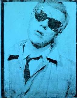
Two of my favorite painters of the 1980's are Julian Schnabel and Jean Michel Basquiat. Schnabel's directorial debut was Basquiat, an elegy to the far too brief life of Jean Michel Basquiat. An incredible cast of actors came together, working at reduced fees to help get this film made. Dennis Hopper, Christopher Walken, Benicio Del Toro, Michael Wincott, Parker Posey, Gary Oldman, and Claire Forlani all lend their services here, but it's David Bowie as Andy Warhol that is that steals every scene he is in,both funny and poigiant simultaneously. Jeffery Wright is absolutely mesmerizing as Basquiat - complex and beautiful.
Schnabel painted all of the works for this film which is nothing short of herculean. If you haven't seen this film, get it, it's required viewing for anyone who likes Basquiat, Schnabel, Bowie, art in general, good music, or just good filmmaking.
BTW - as someone noted on youtube, watch at the 2:58 mark where the camera pans down from the World Trade Center to Basquiat, who is clopping along in shoes with "Titanic" written on them. Fascinating.
Paste's Ten Songs That Should Not Be Covered Again

Paste Magazine is a pretty good music/film mag I read from time to time. Recently they ran a list of songs that should never again be covered by anyone, and I can't help but agree with them. I would like to add that nobody should be allowed (by law) to cover Leonard Cohen's classic "Hallelujah", as Buckley perfected and popularized the John Cale version (which was amazing in it's own right, check out it's usage in Basquiat). Since Buckley has been gone, alot of people have covered the song, but it always seemed like sacrilege to me (even the Rufus Wainright version).
Now, from Paste:
Now, from Paste:
We’ve got nothing against cover songs. In fact, we love a good unexpected cover. But certain songs should be retired after a couple hundred versions. We hereby declare a moratorium on covering the following ten songs.
10. U2 “One”
Just picture it: an over-earnest bar singer propped up in the corner with his music stand and his bulging folder of song lyrics, closing his eyes during the chorus and actually thinking that he can solve the world’s problems by covering Bono’s inspirational hit.
9. Nancy Sinatra “These Boots Are Made For Walkin’”
Dear Jessica Simpson: Your boots are so worn out that you can barely walk in them anymore, and we never want to hear about them ever again. You should stick to designing boots.
8. Fleetwood Mac “Landslide”
It’s not that we have a problem with the Smashing Pumpkins’ or the Dixie Chicks’ versions—it’s everything in between.
7. Oasis “Wonderwall”
Covered by Jay-Z, Ryan Adams, Howie Day, Cat Power, The Beastie Boys, and—most unfortunately—Cartel.
6. Gnarls Barkley “Crazy”
Though the Ray LaMontagne version is kinda cool, the original song was played constantly on the radio for a year, and that was enough. Plus, some would argue that the song’s success lies in its delivery, not the melody.
5. Britney Spears “Oops I Did It Again”
It’s not funny to cover a song simply to be ironic or cute.
4. The Beatles “Hey Jude”
This one is especially annoying when the singer in question gets drunk on the power of leading that crowd singalong part.
3. Bob Dylan “Knockin’ On Heaven’s Door”
If only because Guns N’ Roses perfected it, so there's really no need for anyone else to attempt a cover.
2. Lynyrd Skynyrd “Freebird”
Because if bands aren’t allowed to cover it, then drunk frat boys will have no reason to request it!
1. Leonard Cohen “Hallelujah”
Enough with the covers of Jeff Buckley’s cover of Leonard Cohen’s masterpiece. It’s a beautiful song, no doubt, but “Hallelujah” has to be the most overdone encore for singer-songwriters. We’re even getting tired of hearing Brandi Carlile sing this song. And we don't get tired of Brandi Carlile very easily.
Thursday, April 23, 2009
Morrissey Symposium: Another Reason The Irish Rule

Reason #5,345,234,233,545 that the Irish are amazing - the University of Limerick hosting a two day symposium on Morrissey. No, really. Of course, I won't be able to make it. From their site:
The Songs That Saved Your Life (Again): A Symposium on Morrissey.
April 24th and 25th 2009.
Jointly organized by IWAMD and the Department of Sociology, UL.
Last April over 250 people attended our half-day symposium on Morrissey and The Smiths. The event attracted fans from all over Ireland and beyond as well as widespread media interest. Just days prior to Morrissey’s Irish leg of his 2009 “Years of Refusal” tour, this year’s symposium will celebrate Morrissey’s 20 year career as a solo-recording artiste. This unique event will feature Irish and international speakers presenting papers on Morrissey which will examine, amongst other themes, his iconic status amongst immigrant Latino fans in Los Angeles, Morrissey and Italian popular culture as well as his use of ambiguity in the construction of his identity.
There will be a special focus on current debates about fandom and we are proud to be able to present the European premiere of Kerri Koch’s (2008) documentary on Morrissey’s Latino fans called ‘Passions Just Like Mine’. The event will also include guest speaker Len Brown – author of the best-selling book ‘Meetings with Morrissey’. Len Brown has interviewed Morrissey more than any other journalist. The Symposium will include an evening gig (in Dolan’s Warehouse, Limerick) by the tribute band These Charming Men. These Charming Men have re-created the music of Morrissey and The Smiths all over the world. A full list of conference speakers and further details will shortly be available on the Department of Sociology and IWAMD's websites.
See the Department of Sociology website for more details: http://www.ul.ie/sociology/index.php?pagid=32&useid=grd4978379
Brando Advertisement Predictably Cool
 Perhaps you've been flipping through a magazine recently, only half paying attention to the advertisements, when something stops you. Was that just...Marlon Brando? Yes, yes it was the late great Marlon Brando, all youthful and thin. It seems Armstrong Flooring (not the most glamorous product in the world) had the ingenious idea of using dead cool pitchmen. There is another ad featuring the similiarly cool and dead Dean Martin, though I must say that the photoshop is not quite as mastery in that one. Check them out, they are pretty well done.
Andy Was Always Right
Quote of the day:
"Don’t think about making art, just get it done. Let everyone else decide whether it’s good or bad, whether they love it or hate it. While they’re deciding, make even more art.”
— Andy Warhol
Wednesday, April 22, 2009
Typecamp Clearly The Coolest Place Ever
 Imagine going to a place where all you do is think, write about, talk about, draw, paint, digitally manipulate, dream of, etc. - is type. Now that place can be a reality, at Typecamp.
From Fontfeed:
Fancy a unique, immersive and growing experience in type education this summer? Then Type Camp may be something for you. This typographic boot camp runs from August 9th to 14th on beautiful Galiano Island, British Columbia, Canada. Type Camp is for learning, for exploring, and for inspiring. It is also a chance to experience new cultures, new people, and new practices. As Dr. Shelley Gruendler explains,
Type Camp is just one response to a greater need for the reform of typographic education. Graphic design programs must rethink the integration of all aspects of the typographic profession into their curricula.
Type Camp Galiano in August 2009 will focus on refining your graphic design and typographic work in order to increase readability, legibility, and expand your typographic style. You will learn professional tips and typographic secrets from experts in the field. This edition Dr. Shelley Gruendler is joined by guest instructors Stephen Coles and Tiffany Wardle. The FontFeed’s very own Stephen is editor of Typographica and Type Director at FontShop where he writes about their collection and advises clients on typeface choices. Tiffany is the famous “Typegirl” of Typophile fame with encyclopaedic typographic knowledge. Both have uncanny type identification abilities and are eager to pass along their knowledge to all Type Campers.
Get Born Painting

Last year I completed a commission for a painting, and never took any images of the piece. Such a rookie mistake, but the timing of the event was crazy, as I was preparing to move across the country at the time. Anyway, I was sent a couple of pics of it today, and it was good to see it. Like visiting an old friend. So here is my painting, Get Born - so nice to see you.
Thanks Pete for the pics, I appreciate them.
PS - click the image for a much larger version.
Thanks Pete for the pics, I appreciate them.
PS - click the image for a much larger version.
Tuesday, April 21, 2009
Glasvegas Official Site Links My Atlanta Review
 OK, so yeah, I know, enough already about Glasvegas. But really come on - I just was browsing the Glasvegas official site to see if James' illness was severe (it caused them to cancel their Coachella set Friday night), and found that my review was linked. I know how this sounds, but this is clearly the coolest thing that's happened to my blog so far. I know I'm a nerd, but as a certified FANATIC of Glasvegas, this is so awesome, though not shocking, as Glasvegas totally know how to treat their fans.
And James, should y0u be reading this (since it seems you could be), I hope you are feeling better.
BTW - A Certain Romance is a great blog. In this post he sums up my feelings about Glasvegas. Give it a read, it's excellent.
Old Fake Empire Poster

Here's an old poster for a show of mine that wound up moving dates, and subsequently, the title of the show changed to Intervention and became an entirely different exhibition. I did like this original poster though. I just found it after a couple years and thought it should not die in a drawer but at least live on digitally here.
Click the image for a much larger version.
Enjoy.
Click the image for a much larger version.
Enjoy.
Monday, April 20, 2009
Great New Glasvegas Video
Glasvegas - Please Come Back Home
Everyday I try not to post anything about Glasvegas, and some days I can pull it off, others, like today, I can't. So here is the new video for Please Come Back Home, from the Christmas EP.
The beauty and the elegance of this time of year
Only heightens all the darkness in me
-James Allen, Please Come Back Home
Matthew Carter Interview In Washington Post

Matthew Carter is one of the greatest typographers of all time. It's fantastic to see a major publication like the Washington Post take an interest in Carter. Go read the great interview with him here.
Spiekermann's Type Tips

If you have used any of Erik Spiekermann's typefaces, then you know he is awesome. If you have seen Helvetica, then you know Erik Spiekermann is funny.
1. A CAPITAL MISTAKE
NEVER use CAPITAL letters to accentuate words in running copy. They STICK OUT far too much spoiling the LOOK of the column or page. Use italics instead. If you have to set words in capitals, use proper small caps with or without initial capitals.
2. Connections
There are three different ways to connect or separate words: the hyphen -, the en dash –, a little wider than the hyphen, and the em dash —, wider still. The regular hyphen is easily accessible on any Mac or PC keyboard, whereas the en dash needs the combination option-hyphen on the Mac. The em dash is accessed by pressing option-shift-hyphen on the Mac. The use of these dashes depends on house styles and tradition. The em dash with no space around it is traditionally used to separate thoughts—like this one—but I think its length is a distraction in running text. Try using the en dash to separate thoughts – like this one – with a character space on either side. En dashes without space on either side are also used between numbers and compound words as in: the shop is open 10–7, while you can take the New York–Kansas City train or the New York–Baltimore train only 8am–3pm.
3. “ & ”
A dead giveaway for unprofessional “desktop typography” are wrong quotes and apostrophes. Quotes can have different shapes. They generally look like “this”, and can be remembered as beginning and ending quotes by thinking of “66” and “99”. Beginning quotes are found on the Mac by pressing option-[; closing quotes, option-shift-[. The apostrophe is simply a raised comma, the shape of a ’9 in most typefaces. It is identical to the closing single quote, while the open single quote looks like a ‘6. Beginning single quotes are found on the Mac by pressing option-]; the apostrophe and closing single quote, option-shift-].
4. Figuring It Out
Good text typefaces have “old style”, “text”, or “lowercase” figures – 1234567890 – instead of “lining” ones – 1234567890. Lining figures were originally designed to be used with setting of all capital letters. Lowercase figures blend in better with the text settings, as the figures behave like lowercase letters with ascenders (6 and 8) and descenders (3, 4, 5, 7, 9) and x-height-only characters (1, 2, 0). While they fit in text very nicely, the good looks have one disadvantage: each of the figures have individual widths, meaning they won’t sit directly underneath each other in columns. Their descenders may also clash with ascenders when the columns sit closely on top of one another, as happens quite often in tabular settings. Lining figures are, however, all the same width, making for a somewhat uneven appearance, as the 1 takes up the same space as the 8, but in tables, they are much easier to add up. Some fonts offer “tabular oldstyle figures”, which will allow table setting.
Read more about figure styles.
 5. Joining Forces
A ligature is defined as the visual or formal combination of two or three letters into a single character. They consist of letter combinations such as ff, fi, fl, ffi. Ligatures keep letters from overlapping and improve legibility. For example: affluence, configure, deflate, affinity.
6. Not Justified
Avoid flush settings! Most applications create justified text by hideously stretching and squishing words and spaces. Note that it takes many hours of tedious work to typeset justified text that is truly well-proportioned and legible. For this reason, professionals prefer to use ragged-right composition, either with or without hyphenation, depending on how much line-length variation they wish to allow. This gives the text a more harmonious appearance and makes it easier to read, since all wordspaces have the same width.
Sunday, April 19, 2009
Glasvegas Interview
I know, I know, you are sick of Glasvegas posts. But I like this interview, so here it is.
Stone Roses 20th Anniversary Debut Album
Truly, I have never felt older than right now. This week marks the 2oth anniversary of the release of one of the greatest debut albums of all time, The Stone Roses. As I have discussed the Roses in a previous post, I will not go into too much detail except to say - get their debut if you do not already own it. It is the greatest pop album ever made, and that includes the Beatles. It is the template for Britpop. Still sounds amazing today, thanks to John Leckie's timeless production. So here's to one of the most beloved bands of all time, The Stone Roses. I wish Ian and John would mend their rifts and reunite, if only for purely selfish reasons.
Watch the video, as it's funny to see them so young and wearing goofy 80's clothes. Sounds great though, as always.
Top Ten Suede Songs

This is extremely difficult to narrow a list of my ten favorite Suede songs. My first count was 26 songs - it was incredibly hard to cut it to ten, but that's what makes this a tough task. Inevitably, total classics must be left off. So I've decided that my criteria is based on the songs that mean the most to me. OK, so here is my Top Ten Suede Songs, with youtube links where possible. Enjoy.
1.My Dark Star (Sci-Fi Lullabies)
2.The Next Life (Suede)
3.The Chemistry Between Us (Coming Up)
4.Pantomime Horse (Suede)
5.Trash (Coming Up)
6.Be My God (Single)
7.The Drowners (Suede)
8.Stay Together (Single)
9.The Asphalt World (Dog Man Star)
10.We Are The Pigs (Dog Man Star)
This was so hard because the first three Suede albums - Suede, Dog Man Star, Coming Up - are all five star albums, chock full of perfect epics. Truly one of the most underrated bands ever, a future blogpost will discuss them further, but for now enjoy these.
2009 Ivy Leaves Released

The 2009 edition of the Ivy Leaves Art & Literature Journal has officially been released. Ivy Leaves is a showcase for Anderson University students to have their work published. I was the art director on this project, and it was a massive undertaking. Buy your copy here and support a good cause.
Minneapolis' Wink Design Is Great

Minneapolis' Wink Design is not stop awesome. From their site:
Founded by Richard Boynton and Scott Thares in January of 2000, Wink is a multi-disciplinary design firm that aspires to not only impact commerce, but culture. To date, the Minneapolis-based firm has done work for clients such as Target, Macy's (formerly Marshall Field's), Nike, American Eagle Outfitters, Turner Classic Movies, Toys "R" Us, Chronicle Books, The Limited, Daub & Bauble and The New York Times. Their work has received recognition from publications such as Communication Arts, Print, Graphis, ID, HOW, Step Inside Design, the AIGA, New York Art Directors Club, and The Type Directors Club, among various others.
Founded by Richard Boynton and Scott Thares in January of 2000, Wink is a multi-disciplinary design firm that aspires to not only impact commerce, but culture. To date, the Minneapolis-based firm has done work for clients such as Target, Macy's (formerly Marshall Field's), Nike, American Eagle Outfitters, Turner Classic Movies, Toys "R" Us, Chronicle Books, The Limited, Daub & Bauble and The New York Times. Their work has received recognition from publications such as Communication Arts, Print, Graphis, ID, HOW, Step Inside Design, the AIGA, New York Art Directors Club, and The Type Directors Club, among various others.

M/A/S/H Design Is Fun

The good people over at M/A/S/H Design produce some of the most clever, clean, beautiful work I've seen in a while. From the site:
Mash was founded in 2002 Adelaide, Australia by Dom Roberts & James Brown. This seems a lifetime ago now, and since 2002 Mash has done some growing up, working in many facets of branding, design, visual identity, web design, photography, art direction and copywriting.
Mash also thrives on collaborating with like-minded creative individuals and bodies to construct, present and represent all that is visual. Mash has developed a circle of photographers, copy writers, illustrators and stylists, which means Mash can develop specific
teams to handle a variety of projects.

Lovely Package Is Almost As Good As The Dieline

Lovely Package is a new (at least to me) packaging site similiar to The Dieline. The best thing about Lovely Package is, where possible, they include what typeface(s) were used in the package - which saves me the time of taking them into photoshop, trimming the image to just typography, and then uploading that at what the font. So awesome. Check it out.
Say Hello To Wello

Wanted to throw some traffic in the direction of Wellington Payne's superb work. The sky is the limit for this brilliant designer. Nice blog too, so check them both out. Great work.
Vintage Packaging Rocks
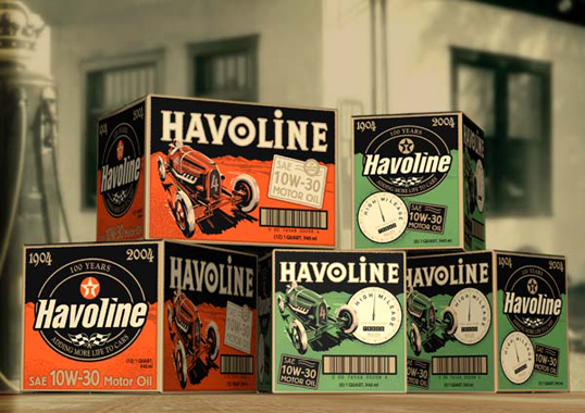
Vintage packaging totally rocks. Anytime you can pull off the retro-package, you win.
That is all.
That is all.
Music Video of the Week: Bat For Lashes
It's been awhile since I have had an official music video of the week. This clip is by Bat For Lashes, who I'm currently digging right now. The song is "What's A Girl To Do" and is cool, but the video is integral. If you have the time, I really like this video too - check it out.
David Lynch Directed Moby Video Is Cool
This is the new video for Moby's "Shot In The Back Of The Head" by David Lynch, one of my favorite directors. Taken from the forthcoming album 'Wait For Me'. To download 'Shot In The Back Of The Head' free go to: moby.com
Saturday, April 18, 2009
We Love Typography Is Addictive

Nubby Twiglet (yep, her again) pointed the way to this great new site, We Love Typography. Take some time an wander around, it's amazing.
Top Ten Manic Street Preachers Songs
 I cannot believe that it took me this long to start posting lists, as everyone who knows me knows I think alot about rankings. In honor of my earlier post about the Manic Street Preachers, here is my Top Ten Manic Street Preachers Songs. I've included youtube links. Enjoy.
1.A Design For Life (Everything Must Go)
2.Sleepflower (Gold Against The Soul)
3.Faster (The Holy Bible)
4.Motown Junk (Single)
5.Yes (The Holy Bible)
6.Motorcycle Emptiness (Generation Terrorists)
7.The Everlasting (This Is My Truth)
8.Die In The Summertime (The Holy Bible)
9.Ready For Drowning (This Is My Truth)
10.PCP (The Holy Bible)
CAUTION - MSP is an acquired taste. They are not for the faint of heart - really, I'm not joking!
The Tudors Is Back, Better Than Ever

I am a big fan of Showtime's The Tudors. The series stars Jonathan Rhys-Meyers as King Henry VIII of England. It is an amazingly tumultuous period of history, one that reverberates through today. Henry VIII's life ripples through the English/Irish Troubles that continue to the present day.
Anyway, the show is fascinating. Rhys-Meyers gives a tour-de-force performance in the series. While he was previously spectacular in Todd Hayne's absurdly underrated Velvet Goldmine (where he brilliantly portrayed David Bowie), it seems that this is the part he was born to play. Rhys-Meyers embodies Henry VIII's royal charisma and brutal ferocity effortlessly.
The new season just began, and it has been riveting. It's so good, that even though I know what is going to happen, I find myself on the edge of my seat every episode. Do yourself a favor and watch them from the beginning. Not only will you be fully entertained, but you can pick up some history while you are at it.
New Manic Street Preachers Is Enticing

In the late 90's, one of my favorite bands was the Manic Street Preachers. Maybe more than any band in history, I felt like the band themselves were occasionally more interesting than the music. At least Simon Price's Everything: A Book About the Manic Street Preachers certainly was more interesting than any of their albums (except for The Holy Bible).
The Manics (or MSP as I prefer) were truly unlike any other band - four friends from the dirty coal fields of Wales, exceptionally literate, self-referential, self-destructive, and occasionally brilliant. Enigmatic, charismatic "guitarist" (the quotations are in place because it is debated how much of his playing wound up on any of their albums, and live his amp would be so low as to be inaudible) and lyricist Richey Edwards (or Richey James) was a true original in rock. In 1994 he disappeared, a true mystery. No body has ever been recovered, and though legally dead, his friends and family still hold out hope that he might return or be found.
MSP soldiered on, releasing the excellent, Britpop classic, Everything Must Go in 1995. After that, it seemed like they got really soft, and the law of diminishing returns certainly came into play upon each respective release. They've had a few good songs here and there, but not an album that is even remotely memorable.
Journal For Plague Lovers is their soon to be released album. Why is this noteworthy?

We’ve been waiting with one hand on the feather boa to see what might come from the Manics’ first return to Richey Edwards’ lyrics since ‘Everything Must Go’. The first peek beneath the tarpaulin reveals a leopard-print beast that shakes off the weight of accumulated myth with a stern, gruff riff, betraying Steve Albini’s production in a heartbeat. Described by the band as “oblique, skewed punk pop” influenced by Pere Ubu, The Skids and Pixies, it picks a deft path between their past and their present. The track opens sweet and restrained, with the understatement of later work, before the refrain of “Oh mummy, what’s a Sex Pistol” breaks into the mile-a-minute, veiny-throated, word-spitting ferocity of old. Full circle and full throttle.
In other words, they are writing new songs with some of Richey's left over lyrics. I am totally OK with this because the writings were intended to be lyrics, not poetry or prose. I hope having to live up to Richey's lyrics cause them to rise to the occasion. I could go on about them all day, but instead watch this.
The cover is again painted by British artist Jenny Saville - one of the best contemporary painters in the world.
Sunday, April 12, 2009
What's On The Digital Turntable Right Now

Sorry for the distinct lack of posts lately. I've been absolutely buried with work, insomnia, work, work, work, insomnia, repeat.
Anyway, had to drop a post about a few things I'm digging right now. More to come, I promise.
The new Gliss album, Devotion Implosion, is great. Mix one part Jesus & Mary Chain + early 90's shoegaze + BRMC + something American = Gliss. Really, really digging this record - it bumps and bounces along, then gets really druggy sounding, then electro, then dance-y. It's awesome - there really isn't a bad song on the album. Opener "Morning Light" sets the tone, all fuzzy and blissed out. Superb. Song of the moment: "Sleep"
New Doves record is out, Kingdom of Rust. Doves are survivors of the Great Britpop wars. Haven't listened to this enough yet, but it's been quite awhile since they came out with something new - always an event. I look forward to doing some critical listening with it - more to come about this.
Tentatively digging the new Bat For Lashes record. The whole album has an atmosphere of operatic darkness. One of those records that I will either fall head over heels for or lose interest quickly. Track of the moment: "Glass".
More to come in the future - I just have to get through the next couple of weeks and then it's on to summer!
Saturday, April 4, 2009
Glasvegas Take Fallon
Glasvegas (or the band whom have secured my undying loyalty) played Jimmy Fallon this week. And they ruled, as usual (it's literally what they do for a living), zipping through yet another great rendition of Geraldine. Awesome.
Enjoy.
Subscribe to:
Posts (Atom)